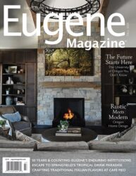
Craving a home refresh? Look no further! The kitchen is a prime place to focus your attention when it comes to home remodeling, because it’s a room that gets used so much. Flip through these pages for some stunning kitchen transformations. These kitchens, while perfectly functional, were uninspiring. Now, they have been reborn as dream spaces that will leave you eager to transform your own kitchen into a haven of functionality and beauty. Stefanie Rotella, a design consultant with Neil Kelly in Eugene, is the mastermind behind these incredible makeovers.
The Waterfall Kitchen
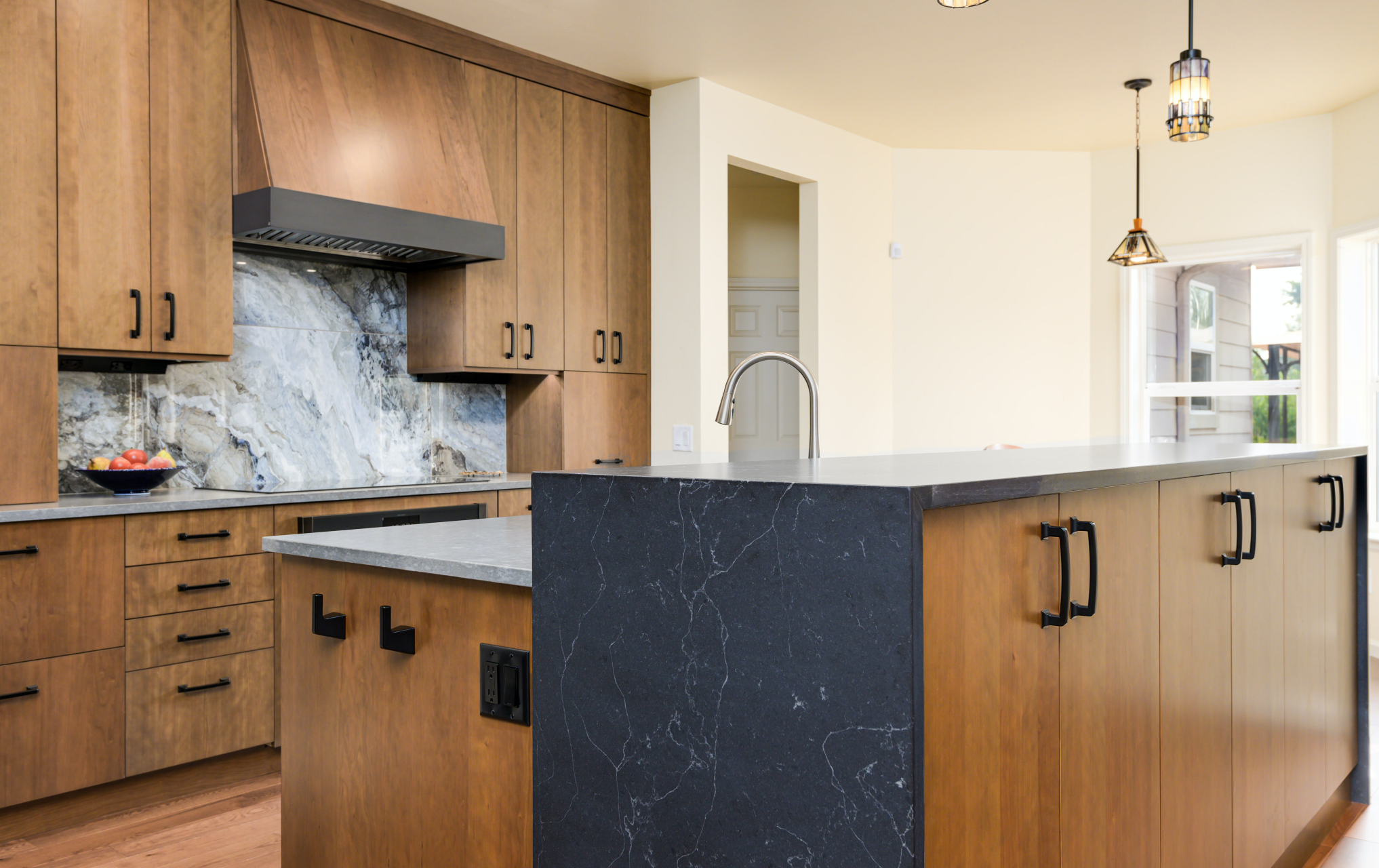
Rotella had worked with these clients on a past kitchen remodel at another home. Their new northeast Eugene home had a transitional style blending modern and traditional, but Rotella needed to also bridge the desires of the homeowners who wanted both fine architectural design but also maintenance and easy cleanability — meaning Shaker-style cabinets were not an option. “She wanted something very simple, very low maintenance,” said Rotella. They leaned into a Craftsman aesthetic with slab doors custom-stained cherry with a charcoal stain for some of the accents such as the band around the built-in hood and on the fireplace.
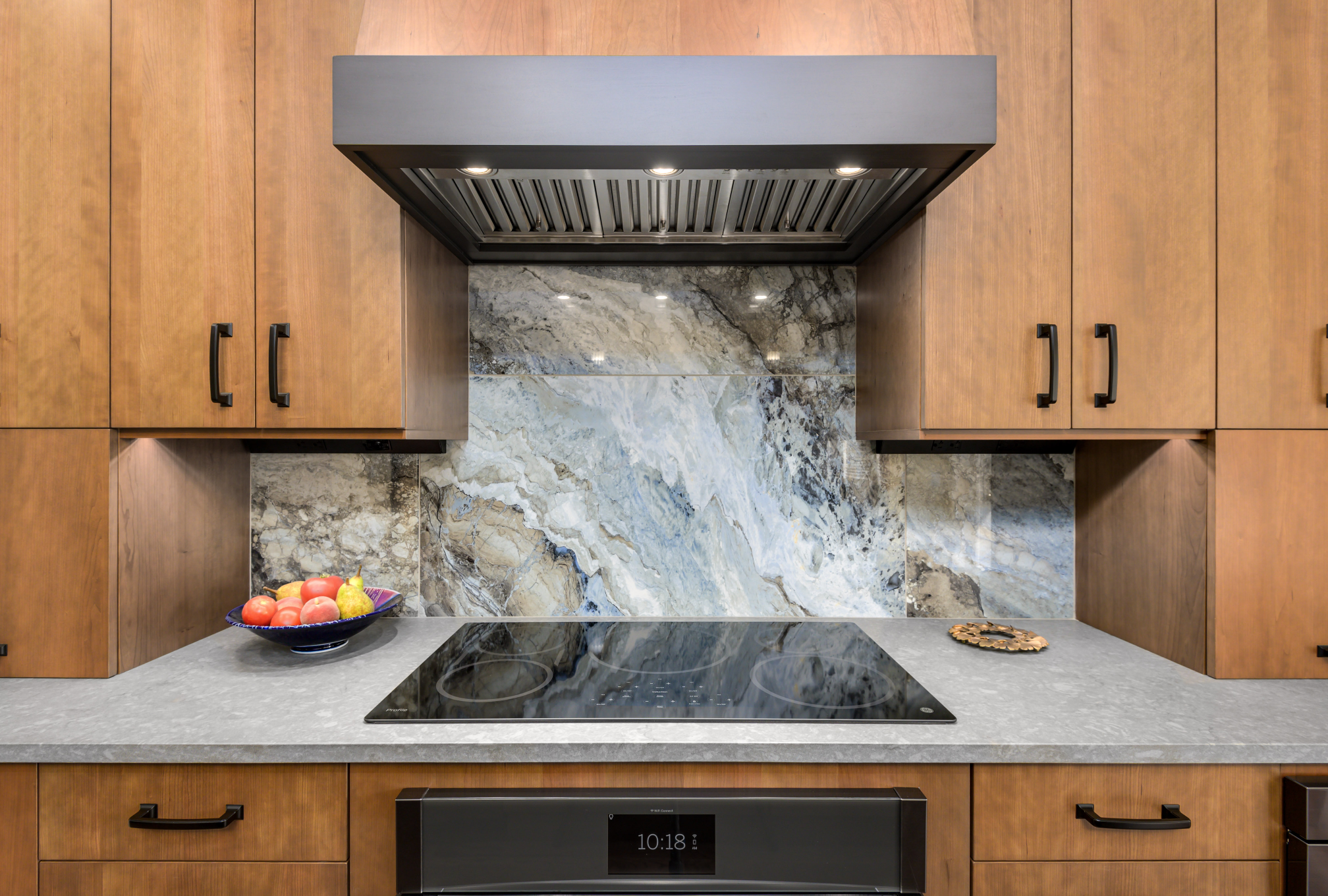
Cabinets that lift upwards streamline appliance storage. One kitchen trend Rotella is seeing more of today is large-format backsplashes. It’s this backsplash, that is 24-by-48-inch porcelain tile, that gives the kitchen its name.
“Our tile setter really set them in a way so that it actually looks like waves crashing on a shore,” Rotella says. “But the beauty of that from the homeowners’ perspective is not only does it look beautiful, it’s also an art piece but it’s also extremely easy to maintain with minimal grout lines.”
While the layout of this kitchen worked fairly well, it had an awkward angled island. That was replaced with a two-tiered Island to intentionally create a division of space and a visual barrier from the main living space into the kitchen. Seating at the island wasn’t needed, so this offered an opportunity for a 42-inch-high raised storage area that protects the sink and adds visual interest. The mitered waterfall edges with the quartz pouring down each side just enhances the scene.
“This kitchen will remain relatively timeless,” Rotella says. “It is always an intention to try to design in a way that not only considers the existing architecture of the home, but also just what is going to last a long time and not necessarily the trendiest thing which will feel immediately dated.”
The Walnut Kitchen
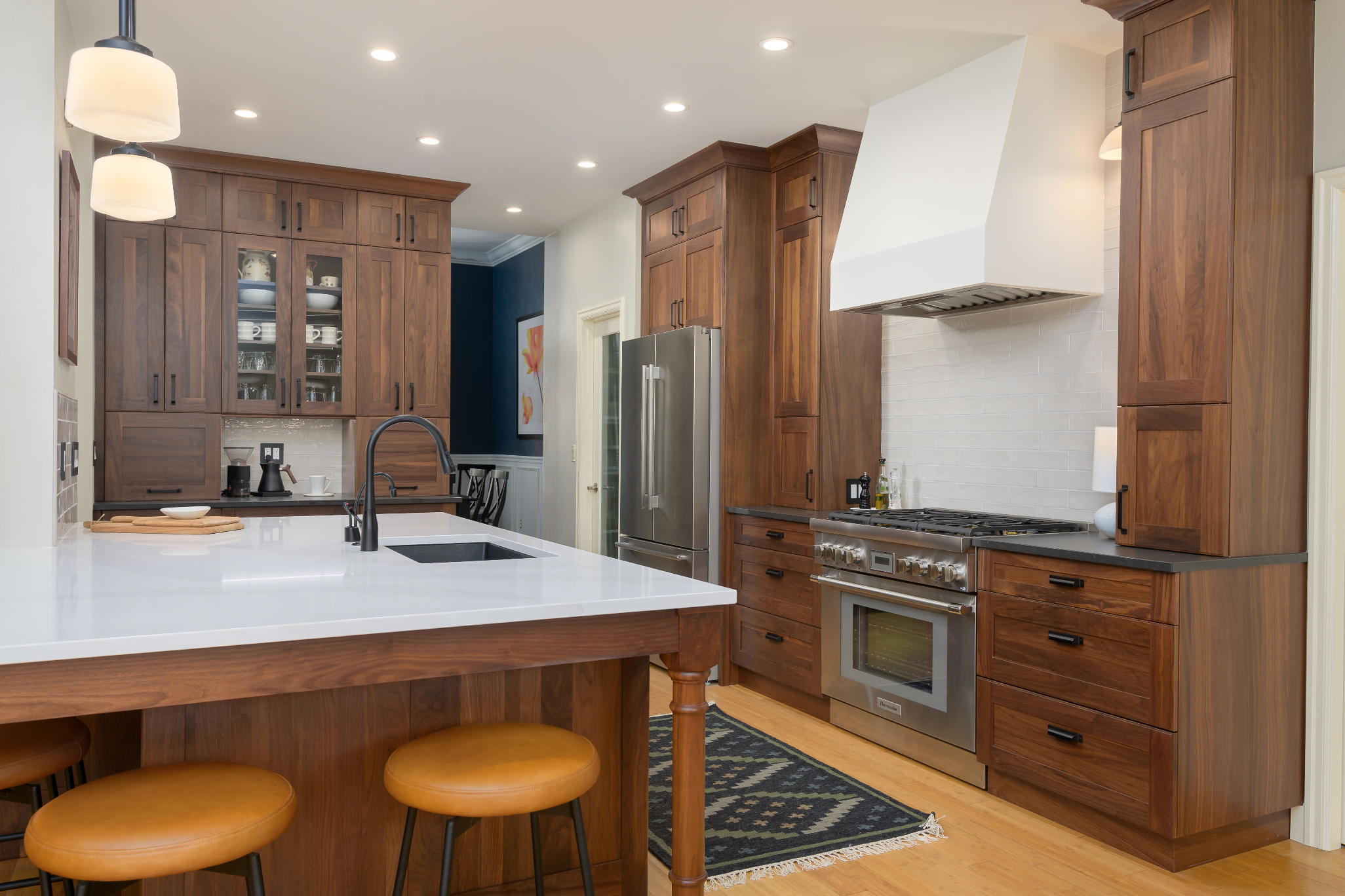
When these homeowners originally built their northeast Eugene home, they were offered limited options for the materials. Decades later, while the kitchen was still serviceable, it was no longer serving them. The original natural cherry cabinets had aged, and the backsplash seemed dated. This project started prior to Covid and was originally intended to be a cosmetic update, which would be refinishing or potentially repainting the cabinets, replacing the countertops and simply aesthetically updating the space, explains Rotella. After a few months of Covid restrictions, their vision for the space had changed a lot. “It became not just about cosmetically updating the space, it was really about making their home their sanctuary and what they’d always dreamed of,” says Rotella.
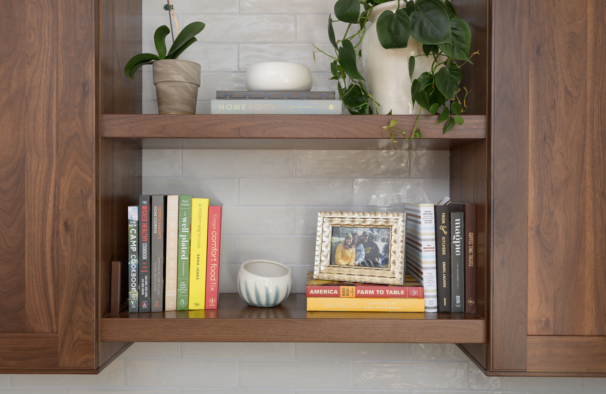
There were some constraints to the space. For one, the flooring, which was a bamboo hardwood, extended through the entirety of the home, so continuity was important. A similar footprint of the placement of items was important also. “The main work triangle of the refrigerator, the cook surface, and the sink stayed in the general location,” says Rotella. The biggest modification was that the original kitchen had an angular peninsula coming off of a wall that was structural. “A pivotal moment in the design was to move away from the angular peninsula to more of a traditional large island that was still attached to that wall. It really completely changed the flow and functionality of the space.” And then of course, just created a lot more opportunity for storage as well as perceiving.
The homeowner had been trying to design around an existing built-in bench, but that never seemed to work. This couple was looking for space to entertain, during and after Covid, so Rotella removed the bench and replaced that with a buffet top and beverage refrigerator.
Appliance doors streamline the countertops, hiding the toaster and the toaster oven. This is the “workhorse” of the kitchen, where the microwave is tucked into a drawer and where the dishware is stored. “It’s intended to be a thoughtful storage space that is a little bit outside of the work triangle where everything is easily accessible,” says Rotella.
New cabinets are Shaker-style walnut cabinets with a light stain that go all the way to the ceiling to bring height to the space. The countertops are quartz that looks like soapstone, and the island is quartz that looks like white-toned marble with large veining. “This kitchen is a transitional design style, with a lot of contemporary elements and thoughtful detailing,” says Rotella.
The Cabin Kitchen
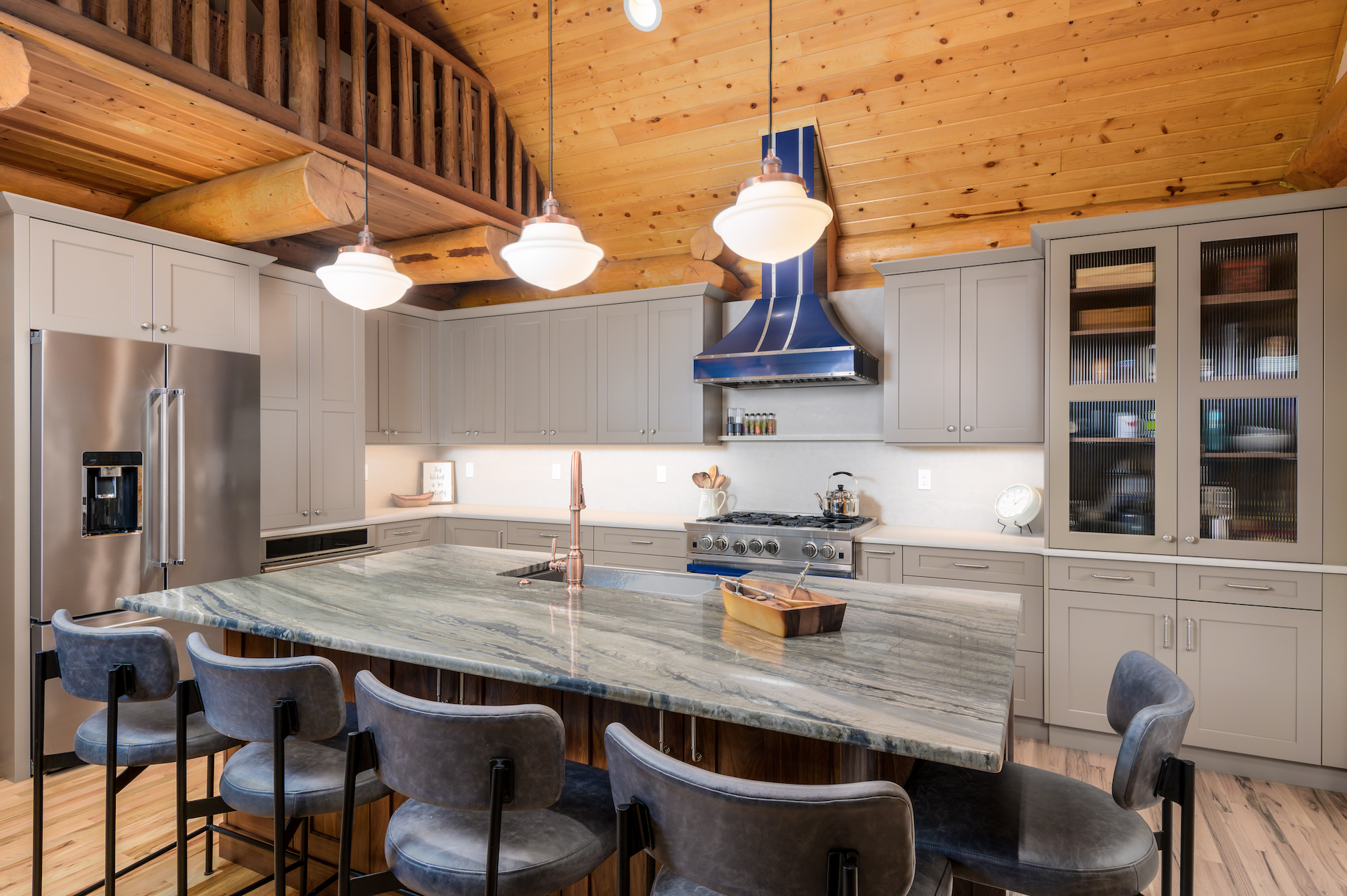
This project was also for a repeat client, one with a large family that uses this cabin along the McKenzie River as a vacation home. Prior to the remodel, the kitchen was very small and took up about a third of the space of the finished kitchen. After expanding the footprint and adding an L-shaped island, the family has plenty of room for cooking, baking, and entertaining, which was very important to this family. There are inherent challenges to working in a log cabin, especially one that features a lot of wood along with multiple wood types — this one had logs forming the walls, a pine ceiling, and an oak floor. The homeowner appreciates a traditional design aesthetic, which needed to blend with the log cabin aesthetic in a thoughtful way. “We opted for a medium-warm walnut tone on the island and a warm gray tone for the perimeter with the intention of setting off the wood behind it,” Rotella says. The star of the conversation is the custom BlueStar range. The custom blue hood continues that statement vertically through the space.
The neutral matte finish for the perimeter, the countertop, as well the backsplash helps set off the blue. The quartzite island top helps connect the taupe tones with the blue tones in the hood.
