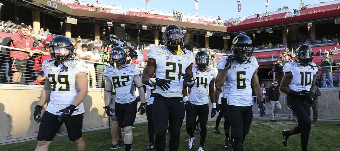
What does it take to dress a Duck? To select just the right font for the football uniforms, or to pick just the right shade of green and yellow to instill shock and awe in the hearts and minds of the players’ opponents.
During the 1998 gridiron season, Nike chief executive Phil Knight set down a personal objective for his alma mater, an objective that many say marked the start of the national ascension of Duck athletics that Oregon is still enjoying today.
“Phil Knight approached us,” recalls former Nike Team Sports (NTS) designer and UO alumnus Rick Bakas, “about updating the University of Oregon branding. His vision at the time was to raise Oregon’s status as a national title contender by attracting better players, better coaches, and growing the Oregon fan base.”
NTS was directed by Todd Van Horne, the man who ultimately commanded the head-on charge into the modern era of flamboyant style and technological innovation in sports apparel design. Van Horne is often credited as the creative and inspirational force behind the emergence of Duck football as the national trendsetter in team sports attire.

There was also another leader in the Nike campaign to bring credibility to Oregon football through aggressive branding via innovative athletic fashion: architect and former UO high jumper Tinker Hatfield. Hatfield designed the original Air Max running shoe, and, like Knight, Van Horne, and Bakas, he helped spearhead the initial efforts to rebrand UO to attract new students and student athletes.
“Nike pays me to be a vision person and a provocateur,” says Hatfield. “We wanted to be out there, to be purposely controversial. What’s a more visible way to turn up the heat and create personality than through football uniforms? So many millions see them on TV, that uniforms become your biggest branding tool.”
And so the NTS design team—aka Nike’s “Innovation Kitchen”—seized upon several key notions to elevate UO athletics via fashion.
They pulled ideas and research from new technologies around the Asian rim. They found, for example, an interest in things that looked sleek and moved fast—like Japan’s bullet trains. The trains were light and moved through space effortlessly—an ideal metaphor for future Oregon skill players.
They also dove into metaphysics, exploring meanings behind natural elements such as lightning, the changing iridescence of a mallard’s head, and the circular, flowing patterns observed in nature.
And then there was Nike’s quest to mirror the kind of determination, competitive spirit, and irreverence exemplified by Steve Prefontaine, Hayward Field track events, and Bill Bowerman’s coaching style. The challenge for the design team, says Bakas, was “how to put all those elements into a blender.”
The first obvious shot of the Oregon rebranding revolution was fired in late 1998, two days before Mike Bellotti’s Ducks appeared in the Aloha Bowl versus Colorado. Postseason Duck uniforms featured a new dark green and bright yellow combo with a new “O” logo replacing the aged, interlocking “UO.” These were topped off by a big stunner—the introduction of a helmet showcasing a green sheen that subtly changed tones in different light, much like a mallard head.
Since then, what has the revolution wrought?
Two decades ago, Duck equipment managers needed only to concern themselves with a single style for each of the uniform components: shoes, socks, pants, jersey, and helmet. Last season the Ducks showcased 15 totally different uniforms, one for each game.
The Ducks have introduced nearly 100 different uniforms since the early millennium. If anybody were ever moved to mix and match the various uniform pieces available to players over that same period, apparently it would provide the Ducks with a wholly unique uniform every game they play through 4000 A.D.
However, the numbers hardly speak to the full impact of the Duck uniform frenzy. It’s become de rigueur for Duck fans nationwide to obsess over uniform colors and styles every time Team Quack hits the field. A whole vernacular has sprung up to describe memorable Duck uniforms: The Electric Jersey Acid Test, Storm Trooper Whites, Combat Duck, Lights Out, Mustard & Relish, Diamond Boyz, Wingin’ It, Blaze & Lightening. . . .
Bold often translates as big. But small uniform details also capture fan attention, such as feather motifs, embroidery, gloves, and logotypes. Take the 2015 Pioneers uniform, featuring a sublimated tonal pattern of the Oregon Trail. Each uniform was unique, showcasing a different section of the maps used by explorers Lewis and Clark. The inside neck of the jersey contained the embroidered slogan, “Salute the State.” A silhouette of the Oregon Duck pointing west was displayed on the socks. The back of the helmet included an image of the 33-star flag from the year Oregon secured statehood.
But let’s not forget the elements of the Nike Team Sports mission that transcend mere style. The modern Duck uniform era has also put a premium on performance technology and player safety. Those objectives have prompted multiple phases in the evolution of Duck uniforms—as Nike’s Van Horne puts it, “We change our uniforms whenever we have innovation.”


